| .. | ||
| img | ||
| LICENSE | ||
| README.md | ||
| spacemacs-common.el | ||
| spacemacs-dark-theme.el | ||
| spacemacs-light-theme.el | ||
| spacemacs-theme-pkg.el | ||
Spacemacs-theme
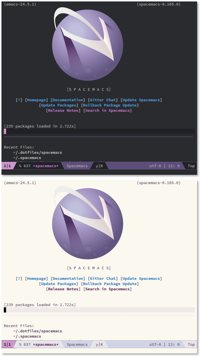
Spacemacs theme is an Emacs color theme that started as a theme for spacemacs. The theme comes with dark and light variants and it should work well with 256 color terminals.
Screenshots
Highlights
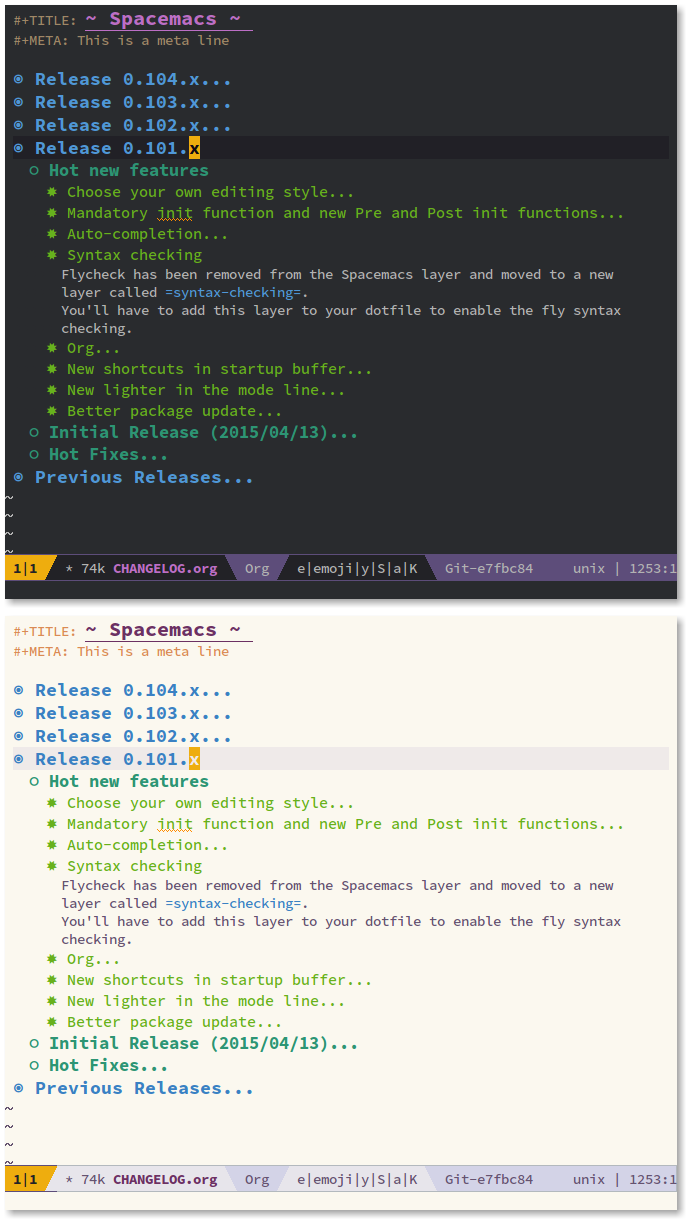
The theme has good support for org mode.
Installation
You can install it from MELPA by:
M-x package-install RET spacemacs-theme
Supported modes
Some of the supported modes are:
- calfw
- company
- ein
- erc
- ESS modes (users may want to customize the variables ess-R-font-lock-keywords and inferior-ess-r-font-lock-keywords)
- gnus
- helm
- ido
- info
- ledger
- magit
- mu4e
- neotree
- org
- and others :) more are coming!
Customizations
The theme has some options that can be tweaked via M-x customize:
spacemacs-theme-comment-bg:
This toggles a background color for the comment lines.
spacemacs-theme-comment-italic:
This toggles italics for comments and will also add a lighter color to it. It is recommended to disable spacemacs-theme-comment-bg if you turn this option on for better contrast.
spacemacs-theme-keyword-italic:
This toggles italics for keywords.
spacemacs-theme-org-agenda-height:
This toggles the use of varying org agenda heights.
spacemacs-theme-org-bold:
This toggles bold text for org headings.
spacemacs-theme-org-height:
This toggles the use of varying org headings heights.
spacemacs-theme-org-highlight:
This toggles highlighting of org headings.
spacemacs-theme-org-priority-bold:
This toggles bold text for priority items in agenda view.
spacemacs-theme-custom-colors:
This allows for specifying a list of custom colors to override spacemacs theme colors. More details in the next section.
spacemacs-theme-underline-parens:
This toggles the underline of matching parens when using show-paren-mode or similar.
Override theme's colors
The theme can be customized by overriding one of the theme local variables by setting a list in the spacemacs-theme-custom-colors variable.
Here's a list of all the local variables and roles:
| var | role |
|---|---|
| act1 | One of mode-line's active colors. |
| act2 | The other active color of mode-line. |
| base | The basic color of normal text. |
| base-dim | A dimmer version of the normal text color. |
| bg1 | The background color. |
| bg2 | A darker background color. Used to highlight current line. |
| bg3 | Yet another darker shade of the background color. |
| bg4 | The darkest background color. |
| border | A border line color. Used in mode-line borders. |
| cblk | A code block color. Used in org's code blocks. |
| cblk-bg | The background color of a code block. |
| cblk-ln | A code block header line. |
| cblk-ln-bg | The background of a code block header line. |
| cursor | The cursor/point color. |
| const | A constant. |
| comment | A comment. |
| comment-bg | The background color of a comment. To disable this, customize spacemacs-theme-comment-bg. |
| comp | A complementary color. |
| err | errors. |
| func | functions. |
| head1 | Level 1 of a heading. Used in org's headings. |
| head1-bg | The background of level 2 headings. To disable this, customize spacemacs-theme-org-highlight. |
| head2 | Level 2 headings. |
| head2-bg | Level 2 headings background. |
| head3 | Level 3 headings. |
| head3-bg | Level 3 headings background. |
| head4 | Level 4 headings. |
| head4-bg | Level 4 headings background. |
| highlight | A highlighted area. |
| highlight-dim | A dimmer highlighted area. |
| keyword | A keyword or a builtin color. |
| lnum | Line numbers. |
| mat | A matched color. Used in matching parens, brackets and tags. |
| meta | A meta line. Used in org's meta line. |
| str | A string. |
| suc | To indicate success. Opposite of error. |
| ttip | Tooltip color. |
| ttip-sl | Tooltip selection color. |
| ttip-bg | Tooltip background color. |
| type | A type color. |
| var | A variable color. |
| war | A warning color. |
There is also explicit colors variables that can be customized:
- aqua
- aqua-bg
- green
- green-bg
- green-bg-s
- cyan
- red
- red-bg
- red-bg-s
- blue
- blue-bg
- blue-bg-s
- magenta
- yellow
- yellow-bg
The green and red colors have two background versions. The green-bg and red-bg are normal light background colors. The green-bg-s, red-bg-s, and blue-bg-s are stronger versions.
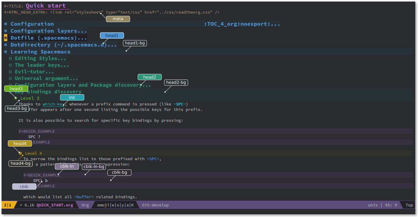
Here are some screenshots of the various variables:
If you are using spacemacs, you can put this snippet in your dotspacemacs/user-init to override these colors:
  (custom-set-variables '(spacemacs-theme-custom-colors
                          '((act1 . "#ff0000")
                            (act2 . "#0000ff")
                            (base . "#ffffff"))))
This will override act1, act1 and base to use the specified colors.
Use a custom flycheck fringe bitmap
If you don't use spacemacs and want to get the same look of flycheck fringe bitmap, you can put the following snippet into your init.el (this assumes you are using use-package):
(use-package flycheck
  :init
  (progn
    (define-fringe-bitmap 'my-flycheck-fringe-indicator
      (vector #b00000000
              #b00000000
              #b00000000
              #b00000000
              #b00000000
              #b00000000
              #b00000000
              #b00011100
              #b00111110
              #b00111110
              #b00111110
              #b00011100
              #b00000000
              #b00000000
              #b00000000
              #b00000000
              #b00000000))

    (flycheck-define-error-level 'error
      :severity 2
      :overlay-category 'flycheck-error-overlay
      :fringe-bitmap 'my-flycheck-fringe-indicator
      :fringe-face 'flycheck-fringe-error)

    (flycheck-define-error-level 'warning
      :severity 1
      :overlay-category 'flycheck-warning-overlay
      :fringe-bitmap 'my-flycheck-fringe-indicator
      :fringe-face 'flycheck-fringe-warning)

    (flycheck-define-error-level 'info
      :severity 0
      :overlay-category 'flycheck-info-overlay
      :fringe-bitmap 'my-flycheck-fringe-indicator
      :fringe-face 'flycheck-fringe-info)))
Like the theme and want to use it in other places?
Then check out this project base16-builder.


